Ian Ardouin-Fumat

Overview / Process

Aurora is a suite of data driven experiences visualizing the communities and conversations happening on the Twitter platform in real time.

I joined the project in 2017 in order to consolidate its data processes, and develop new visualization tools that investigate the propagation of viral content across social media.

01/05/2020

A live map of Twitter

At any given moment all over the world, Twitter is filled with rich and vibrant conversations between people from a wide breadth of cultures. Twitter Aurora explores how these communities evolve and interact.

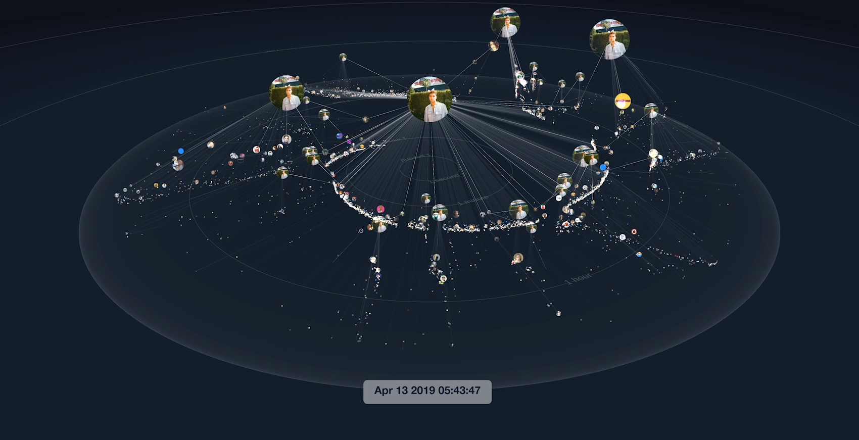
At its core, Twitter Aurora is a live map of Twitter. It visualizes conversations on the Twitter platform, and provides new ways to discover trends among diverse interest communities. It helps understand Twitter from a new viewpoint, beyond the timeline that we're used to. In that way, it helps Twitter tell a human story from a very complex data system.

Twitter Aurora visualizes the 200,000+ most influential users on the platform, and groups them into communities and locations.
Interest community visualization of the Twitter universe

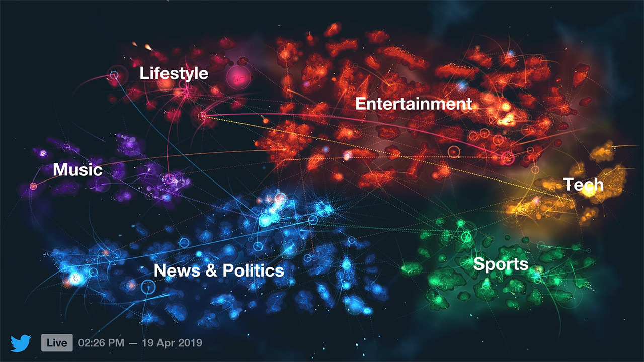
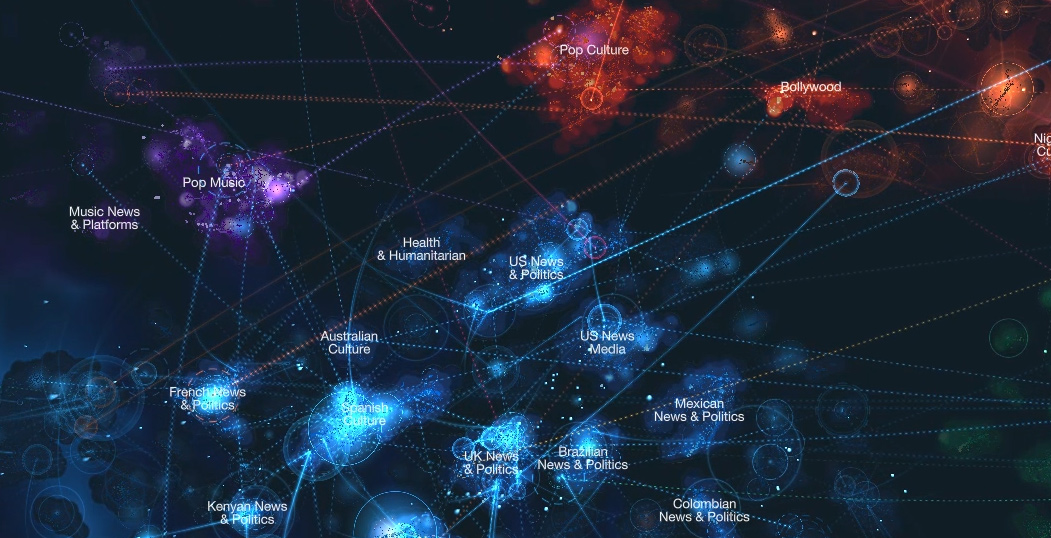
The Interest mode is the heart of the Aurora experience, where users are grouped into communities based on the followers they have in common. By arranging our data in community clusters, we can identify pockets of culture on the platform. Some of them are expected and widely accessible, like the Popular Culture cluster, or the NBA fans community. Others are unheard of from the mainstream, like the Indonesian LARPing community.

At high level, clusters are grouped together in continents that represent a number of 'passions' derived from Twitter branding: News & Politics, Entertainment, Music, Sports, and Technology. Within clusters, users appear close to those who share followers with them, and their altitude is mapped to their following, which creates unique topologies for each community. Aurora lets users navigate through this landscape of Twitter culture, and explore how different communities interact over time.

Location visualization of the twitter universe

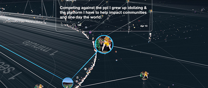
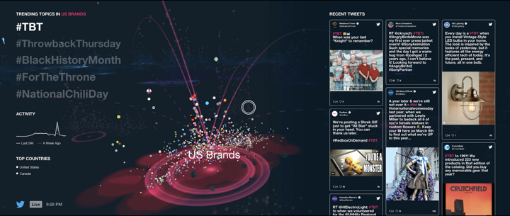
In Geo mode, we see a representation of our world; different countries and trending topics. Tweets shoot across the screen as topics are being discussed in real time. When users hover over a trending topic, countries that are having conversation about that trend/hashtag light up.

Twitter Aurora' interactive experience in Twitter's San Francisco headquarters. The control wand that enables navigating through the 3D visualization space was designed by Oblong.
Twitter Aurora installed in Twitter's San Francisco headquarters

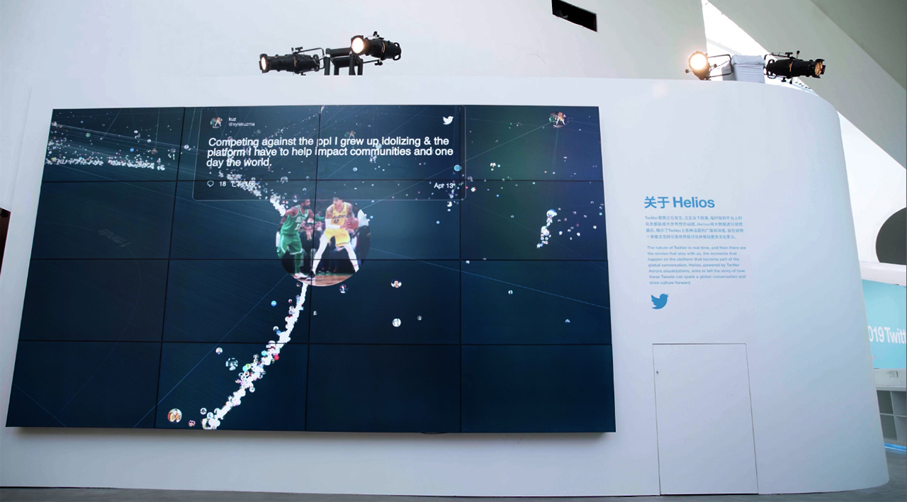
Twitter Aurora was exhibited at Twitter's headquarters in San Francisco, where people could experience it in person. The experience was immersive and interactive as people navigate through a live universe of interests and conversation from around the world, in real time.

Twitter Aurora installations in San Francisco.
Twitter Aurora installed in Twitter's San Francisco headquarters' common areas
Twitter Aurora installed in Twitter's San Francisco offices

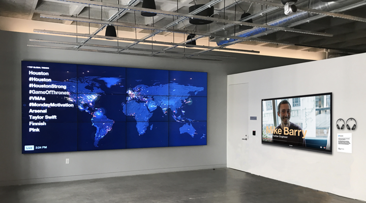
The project also had an outlet on dozens of screens scattered in many offices around the world, where Twitter employees could see a passive version of the software summarizing current trends on the platform. It also was installed in many high-profile marketing events, including at CES in 2019.

Twitter Aurora was initially called Twitter Manifold, and was a spearheaded by the Office for Creative Research, commissioned by Twitter's Amanda McCroskery. The initial team involved many talents including Jer Thorp, Genevieve Hoffman, Chris Anderson, Marcus Pingel, Ryan Bartlett, A'yen Tran, and Will Lindmeier.

I joined Twitter #Studio in 2017 after the OCR had handed over the first version of the projet. I worked as a data scientist in support of existing initiatives, and progressively took on more responsibilities in developing new visualization tools.

The Twitter Aurora team in 2019 (missing on this picture: devops engineer Kevin Lee)
Portraits of the Twitter Aurora team members
01/05/2020

Data processes for visualizing interest communities

Our taxonomy lists 150 interest clusters ranging from news and politics to entertainment, sports and music.
A big-picture view of all interest communities part of Twitter Aurora's taxonomy

The initial interest clusters layout was produced in 2016 by the Office for Creative Research, based on the Map of Twitter, a earlier Twitter Hackweek project that made use of the tSNE algorithm to visualize the breadth of communities on platform. Of course, this kind of data degrades quickly, as the communities relevant in 2016 had changed a lot over the course of a year.

My first responsibility as I joined the team, was to document, refresh, and streamline all the data processes involved in creating a user layout for Twitter Aurora. This took a lot of research, as knowledge fades quickly within large organizations. I was however able to locate the relevant sources, improve the process, refresh our data set, and map out future efforts toward improved accuracy and automation. Below is a quick summary of the steps involved.

Icons summarizing data processes for Twitter Aurora: data collection, content moderation, layout generation, and manual curation

Data collection: user profiles

The initial step required collecting an updated set of users. In order to create a new layout with a similar number of users visualized, we took into account the amount of profiles that were previously filtered out in order to predict the right number to pull in this time around.

User profile moderation

Originally done manually by an external vendor, we were able to transfer this process over to Twitter's Trust & Safety team, which was able to filter out accounts deemed not safe for work. The automated approach taken here lacked perfect accuracy in detail, an issue that was mitigated by our information design decisions, and careful review of celebrity accounts.

Social graph reduction

Example output from the t-SNE algorithm based on our social graph.
Visual output from the t-SNE algorithm. User profiles group together in clusters

In order to compute a user layout that highlighted topics of interest, we made use of the social graph and dimensionality reduction techniques. We sampled a large number of Twitter profiles and looked who of our 250k popular users each of them were following. This provided us with a large sparse matrix that described how our popular users were followed, which we were then able to reduce by using a Singular Value Decomposition algorithm (which was done thanks to Twitter's cluster computing infrastructure), and finally visualize with t-SNE.

The whole process took a lot of fine-tuning. Since then, new algorithms have been released, which might provide better results for future experiments.

Automated and manual clustering

Timelapse of the cluster manual arrangement process, done in our custom web editor.
timelapse of a web app where we rearrange clusters of users together

In order to create a more legible experience, and because the t-SNE output doesn't hold significant meaning for nodes that appear far apart from each other, the OCR had decided to rearrange clusters into a manually curated layout. This was done by identifying clusters with DBScan, and then manually arranging the resulting grouping.

In an ideal world, the clustering should be done before dimensionality reduction, but for the sake of consistency with our previous layout, we took a similar approach. I however created a new curation tool that enabled us to rearrange clusters efficiently.

For cluster labeling, we defined a set of rules and brought in semantic annotations from our user set in order to name communities sensibly. A lot of manual work was involved in order to satisfy all stakeholders involved.

Layout evolution over time

We were able to reproduce this whole process a number of times without compromising the stability of Aurora's general layout. Doing so, it was fascinating to witness the evolution of culture over time on the platform. For instance, over the course of a couple years, we could see the Justin Bieber and the One Direction clusters merge into the general Popular Culture cluster, while new boy bands like EXO and BTS emerged as their own, dominating clusters. Other popular topics like Sneakers and Cryptocurrencies also spawned as full-blown communities. The cluster dedicated to the fans of pop music show The Voice started intersecting with the Country Music cluster. The Kardashian family cluster became its own, small isolated island.

Of course, a lot of work would still be required in order to make this process more automated and rigorous. Something we did not get to, would be to compute a series of layouts based on historical data that goes all the way back to the infancy of the platform. This would let us see the organic evolution of Twitter culture over the course of a decade.

Capture of a layout experiment that ended not being used in production.
A circular layout of interest communities.
01/07/2020

New tools for conversation discovery

In parallel of my work refreshing community data for the main visualization, I started exploring how the tools at our disposal could help us understand the shape of conversations on social media. We were especially interested in uncovering how viral content propagates across the platform.

Icons summarizing data processes for finding conversation content: tweet collection, conversation tree generation, content curation, and additional data collection.

To begin this investigation, I started collecting the most viral content that Aurora's backend was catching on a daily basis. From there, I used Twitter's internal services for building out 'conversation trees' (every reply to a tweet, and their own replies, and so on) from those data points. This was not something easily done with existing APIs, so it took a lot of research on our end in order to get to a satisfying result. Ultimately, by limiting ourselves to 10 degrees of recursion, we were able to catch an average of 99.9% of all conversation trees we looked at (this is due to the large volume of tweets involved in the conversations we were interested in).

Timelapse of our custom conversation discovery tool in action.
Capture of the conversation discovery tool in action, where we visualize the shape of many viral conversations

In order to make sense out of the sheer volume of data collected, I designed and developed a simple web interface that let us review all conversation trees and sort them based on a number of metrics. Already, this allowed us to better understand the many shapes of Twitter conversations. Eventually, the tool also turned turned out to be helpful for curating future visualization content.

Three types of conversation shapes. Sources include a thread, a tweet related to politics, and a tweet from a pop celebrity. Each feature distinct reply patterns.
Shape of a threaded conversation: the replies are scattered from one post to the other, looking like a flower bouquet.
A political conversation, shaped like an explosiion, with very deep conversation branches.
Shape of a celebrity conversation with their fans: the conversation looks mostly flat.

While Pew's study of Twitter's shapes of conversation focused specifically on overall group interactions, our tool helped us identify a wide range of patterns within single conversations. It also helped us explore other dimensions, like volume and time. Quickly, recurring patterns started to emerge and we were able to identify conversation types.

01/08/2020

Helios, powered by Twitter Aurora

The data experiments mentioned above quickly morphed into an entirely new project for the Aurora team. While the regular Aurora experience gave an overview of the Twitter universe and the live events that rocked it, this new visualization, called Helios, would tell the story of single tweets that sparked global conversations. I spearheaded design and development efforts for this project, from prototyping to production.

Helios was not born in a vacuum. In fact, the OCR had intended to create something very simiar from the very inception of Aurora, but was not able to pull it off because of the limitations of the data they had access to. Going further back, the concept behind Helios really came from the New York Times' Cascade experiment by Jer Thorp, who laid the ground for this visualization work. Helios takes visual clues from these references.

From left to right: Jer Thorp's Cascade, Will Lindmeier's work for the OCR, and Rare Volume's work for Twitter.
visual reference: NY Times Cascade project
Visual reference: some earlier work from the OCR
Visual reference: some earlierwork from Rare Volume

Helios visualizes the propagation of a conversation across the Twitter platform. To do justice to the complexity involved, it leverages a spatial representation of tweets over time, and focuses the viewer's attention to different scales of events as the animation unfolds. In Helios, tweets are represented by the avatar of their author. Replies to a tweet are linked to their parents. Each node's diameter is mapped to the number of retweets a message has received, and its altitude corresponds to the number of impressions generated. The passing of time is shown by the concentric rings displayed on the ground plane, which indicate the following time marks: a second, a minute, an hour, a day, and a week. Because most of conversations unfold briefly after the first message was posted, we used a non-linear time scale, which helped legibility.

From a technical point of view, we wanted to make Helios as widely accessible as possible, which is why we opted for building it in WebGL. The voume of data involved (up to 180,000 tweets per conversation) required a lot of optimization work, given the final product would need to run at 8k screen resolution. We opted for using react-three-renderer as a way to bring React's flexibility to Three.js' rendering power.

Ultimately, Helios' final release allowed users to navigate through a set of 12 different conversations, that represented a variety of topics and shapes of conversation. It was especially interesting to compare the visual signature of each conversation, as different prompts resulted in radically changing tweet trees.

Helios visualization of a conversation initiated by Chance the Rapper and Wendy's
Helios visualization of an intense, short-lived conversation initiated by BTS member Jimin
Helios visualization of a voluminous conversation initiated by Starwars.

Political conversations often showed intricate patterns, in which polarized arguments generated deep conversation branches. On the contrary, conversations initiated by pop culture celebrities often generated short-lived, intense and unilateral reactions from their fans. Other particular conversation types, like Q&A sessions between celebrities and their audience, created comple landscapes where the original poster appeared in many places throughout the visualization.

Photograph of Helios exhibited in Beijing
Photograph of Helios exhibited in Beijing, from another angle

Helios was not only exhibited at Twitter's headquarters but was also taken on tour in several countries. In May 2019, it was featured as a starring data experience during Twitter's 2nd annual Brand Summit in Beijing. It was also exhibited in similar marketing events in Tel Aviv, Dubai, and Singapore.